
Hello!
On this post we’ll see a more “minimalistic” board portraiting the number of fires in the Amazon Rainforest. This is not original from me, but a copy of what was made by the Youtube channel Curbal.
The board was made based on some charts (below) posted by twitter used @g_fiske + a dataset from Kaggle + Rose Charts made on Charticulator.


The columns present in the dataset were: Brazilian States, Latitude, Longitude, Years, Monts, Firespots.
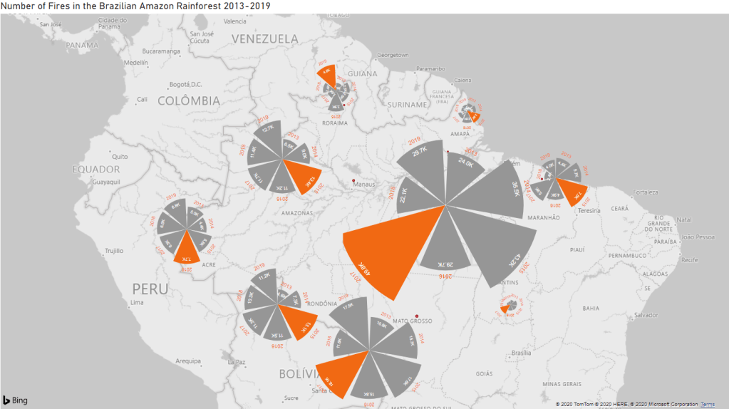
The Board #1
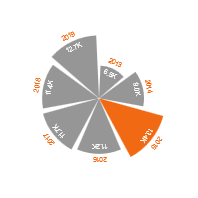
The design idea they had for the chart was that they wanted to show the “progress” of fires along the years while also showing the locations in the map. While several bar charts wouldn’t be asthetically pleasing (plus, taking a lot of space and messing up the axis values), a Rose Chart can provide the information using less space and making the visualization pretty.
The thing is that Power BI doesn’t have a Rose Chart visualization, so what do we do? Create it somewhere else and import to Power BI! With the Youtube guidance I was able to create the chart on Charticulator and then just put the information and adjust the ratios while in Power BI. The chart reads as X Axis = Years, Bars = # of Firespots, Highlighted Bar = Year with the highest number of firespots.
Conclusions we can take:
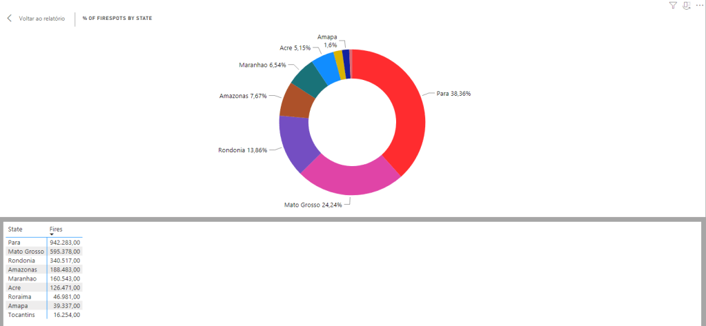
- Pará is by far the most affected state by fires;
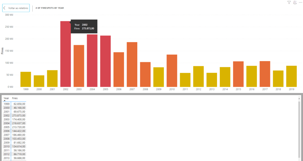
- The highest number of fires in the majority of the states happened between 2015-2017, so those years should be a focus if you want to trace the causes;
- The states with the largest numbers (Pará and Mato Grosso) are know for having two very destructive economic activities: Mining and Cattle, respectively. Both need the forest to be destroyed so they can exist, so, many people ilegally burn/cut down the forest in order to expand their “working” areas. States like Rondônia, Acre and Amazonas suffer from the same problem, but in lesser aggression.
Ps: Adding the years and numbers to the chart was my choice, as it was confusing to leave the chart empty and without any extra reference of which year is which bar/how many fires each bar holds. The original board made by Curbal was more minimalistic than this.
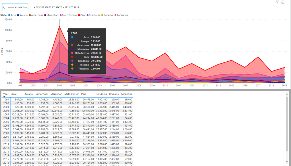
The Board #2
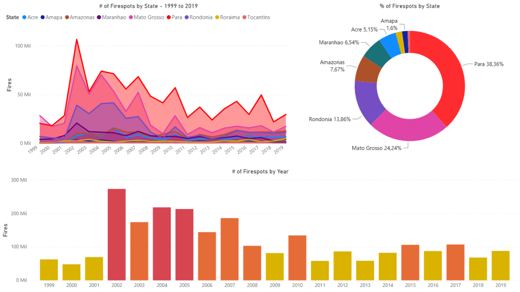
This other board is not a copy (yay!), just some extra charts I did with the data so we could analyze through other angles.
Using the same data, but including the years 1999-2019 (we filtered to 2013-2019 on the previous board), I was able to do 3 charts that show us how the number of Firespots behaved and where they were appearing the most. Same idea of the rose chart, just visually different and more “traditional”.
Below are the charts broken down:
Conclusion
This was a great exercise to practice creativity in Power BI and new tools (charticulator), also, it’s the first time I can work on a board that speaks about a real world issue instead of a business problem or personal data, so it feels really important. If we research more into the subject, for sure we will be able to locate a lot more insights in the charts.
