On this post I have a dashboard that shows the analysis of an E-Commerce website with data obtained from Google Analytics.
Here we can see the columns:
ps: Only the company has access to Google Analytics results. This originates from an exercise, so I didn’t use google analytics, but had the dataset handed to me.
For this exercise there were some questions to follow on the construction of the board, let’s see them.
The Analysis
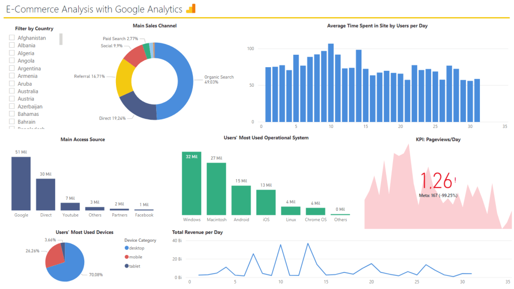
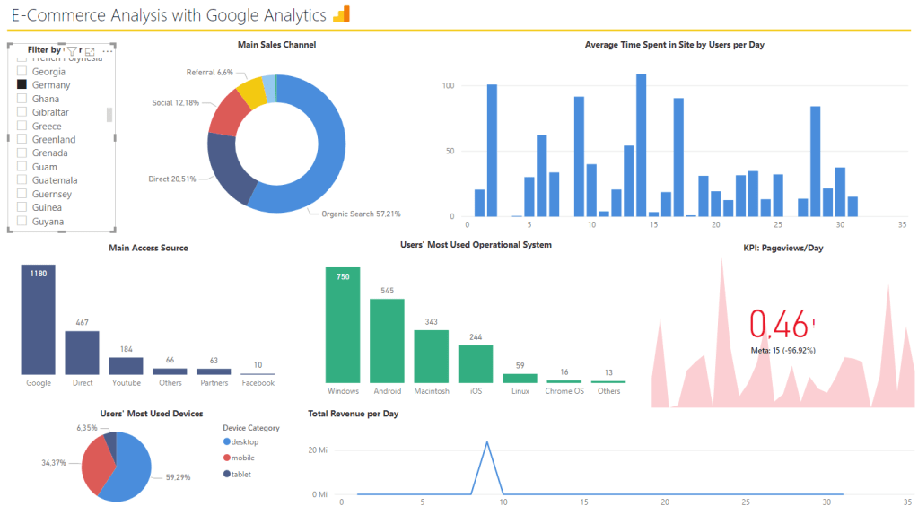
Full Board
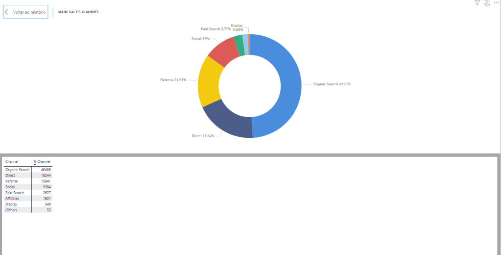
1. How do the clients access our portal? Through Organic Search or Paid?
Close to 50% of the accesses are through organic search, much more than through paid search.
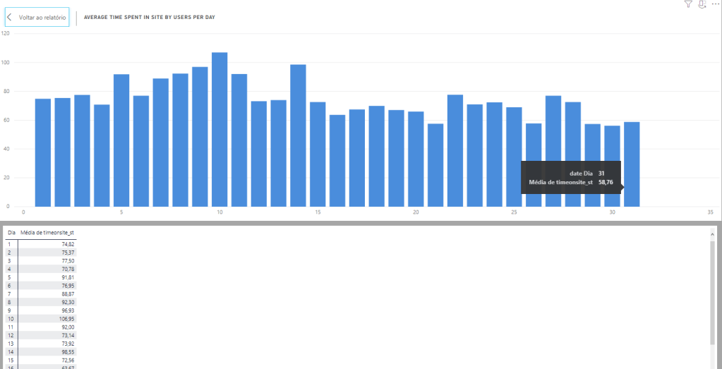
2. In average, how long the users stay in our portal per day?
The gaps between time spent in the portal from day to day is not that big, but we see people used to spend more time during the beginning of the month than during the end of it.
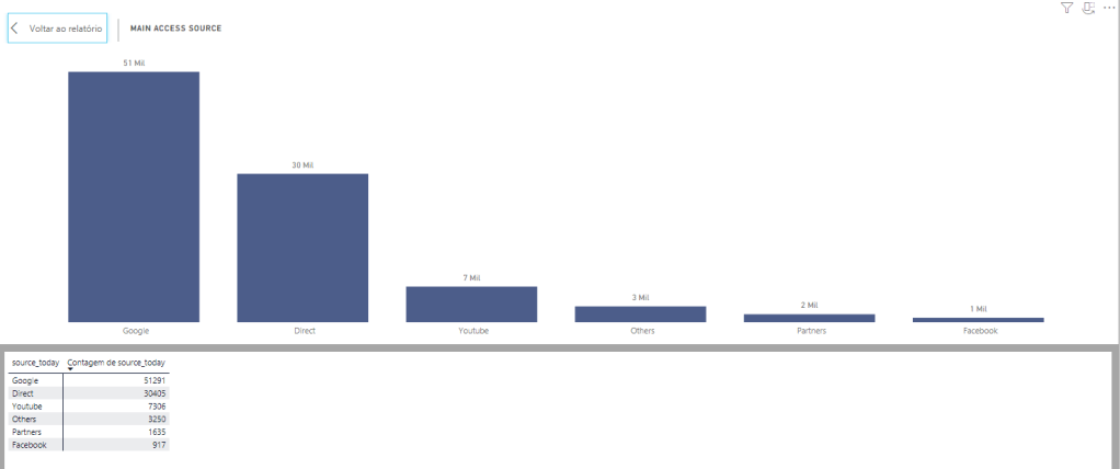
3. What is the main source that directs users to our portal?
Google and “Direct” together are the sources of more than 80% of accesses.
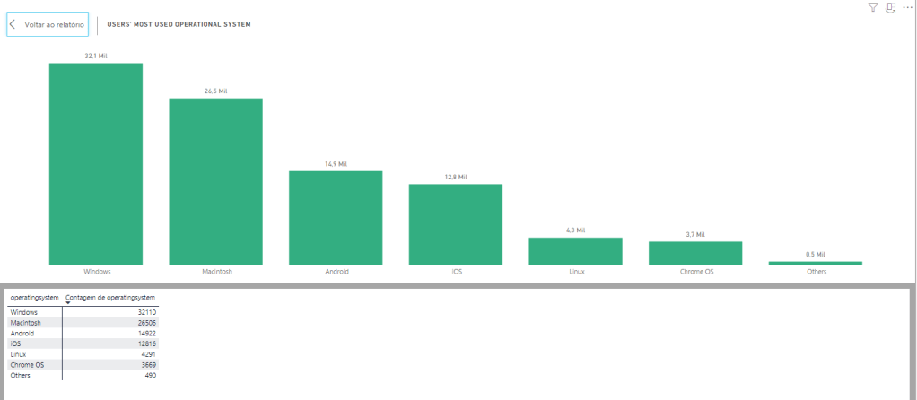
4. What is the users’ most used Operational System?
Windows and Macintosh show people access more through computers, but Android and iOS seem to be approaching them in the future.
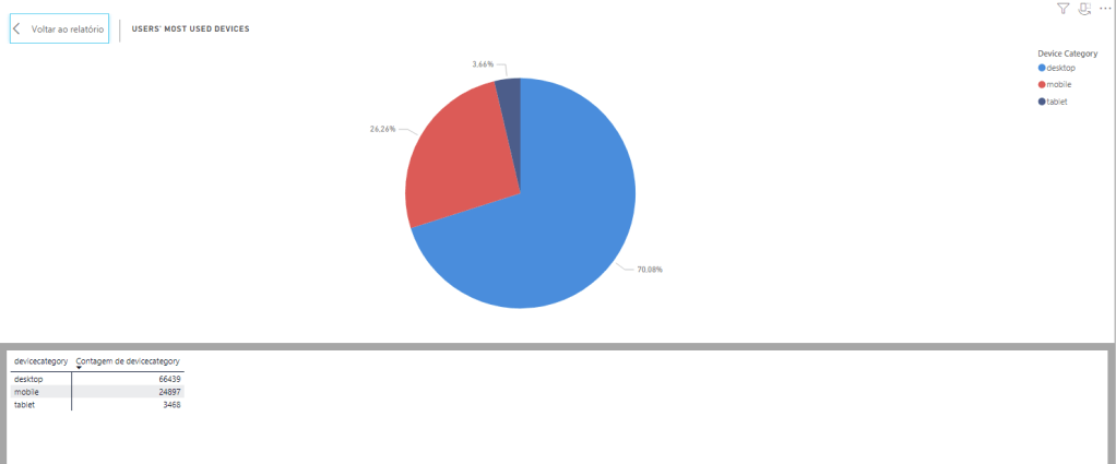
5. What is the users’ most used dispositive?
As seen in the question before, users tend to access through desktop/laptop, with the Mobile option expanding itself.
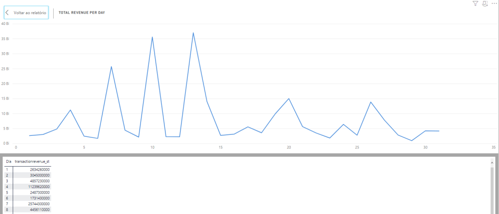
6. What is the total revenue per day?
High spikes in the beginning of the month, matching the analysis on Question 2, where we observed that people spent more time in the site during that moment (days 5-15).
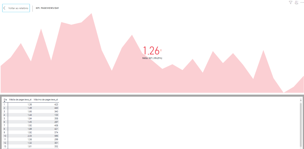
7. How is the situation of the portal by the KPI pageviews/day?
Using the maximum number of pageviews reached as the goal and pageviews average as current performance, we see how we are doing and how much more we need to work in order to reach higher.
8. How is the situation of the portal and users in Germany?
Germany users spend more time in site than the general average in some days of the month, but the pageviews are not high and revenue was only generated between days 5-10. The managers in Germany should plan how to convert better the casual users to buyers, focusing on the ones who come from google (more than 50%).
Conclusion
On this post I wanted to bring more attention to the charts, with only a bit of text to back up as the information is easy to understand. This was an “easy” challenge to fulfill in terms of analysis because I’ve done a lot of dashboards like this one, but not that easy in terms of design because I’m still learning how to make my boards look impactful and storytell. Either way, felt good to do this one.