
Hello!
On this post I’ll show you a dashboard that I did for a challenge!
The challenge consisted of being able to answer 10 questions with 1 dashboard. The data source for it was a .csv file that contained a few columns of: Region, Age, Number of Children, Smoker or Not, IMC, Gender, Spending Value.
On the next topic, let’s see the answers to the questions one by one.
Analysis
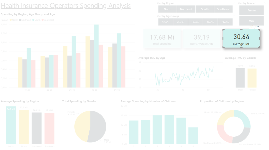
Question #1: What is the total spending of the operators?
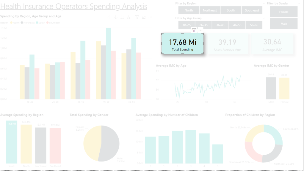
Simple and direct answer using a card with the total sum of the spending values.
Question #2: What is the users’ average age?
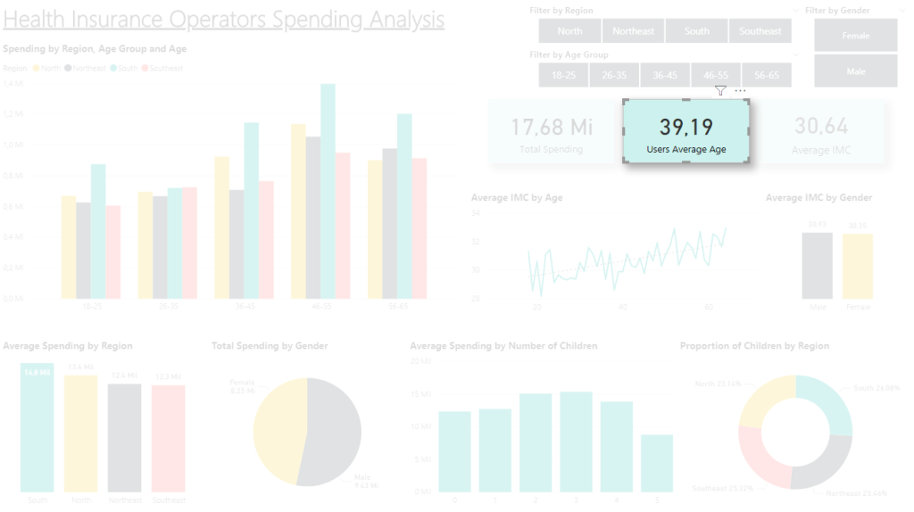
Again a direct question answered with a card. We can see that our users are mostly between 30-50.
Question #3: What is the average spending by region?
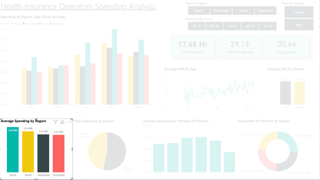
For this I used a column chart, where we see the regions are no that different in terms of average spending, with R$2.500,00 (USD 450,00) separating South from Southeast.
Question #4: Which age group spends the most with health insurance by region?
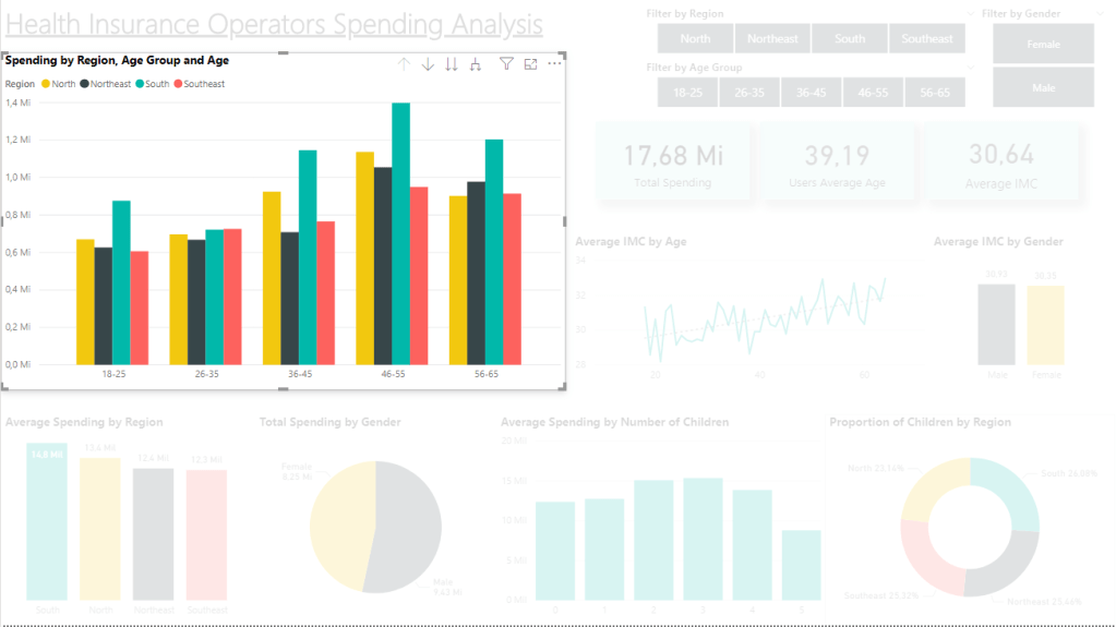
For the age x spending question, I used a column chart with the total values for all regions in all age groups. We can see that the South region leads in the majority of groups, only losing to the Southeast for a little bit on 26-35. Meanwhile, the other regions are not as consistent, appearing in different ranks for each group.
Through this, we can also highlight how the costs raise along the ages, peaking for all regions on 46-55 and getting lower on 56-65 (can be due to this age group having less data).
Question #5: Do children spend more than adults?
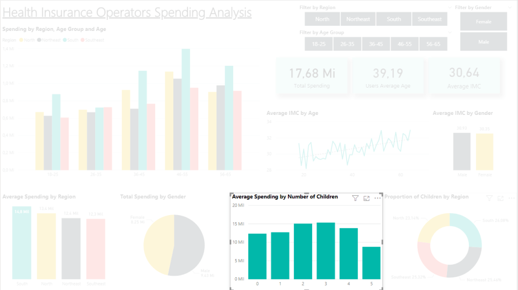
This question is a bit complicated, as it doesn’t fit the dataset so well. My interpretation was that the “children column” in the dataset indicated the number of children the user has and that those children are included in the user’s spending value.
Through the chart, we see that people with 2-3 children spend in average more than the rest, but only about R$ 3.000,00 (USD 550,00) more than the average of people with zero children. With that we can affirm that having children can raise the costs, but 1 child doesn’t spend more than an adult.
Question #6: What is the proportion of children by region?
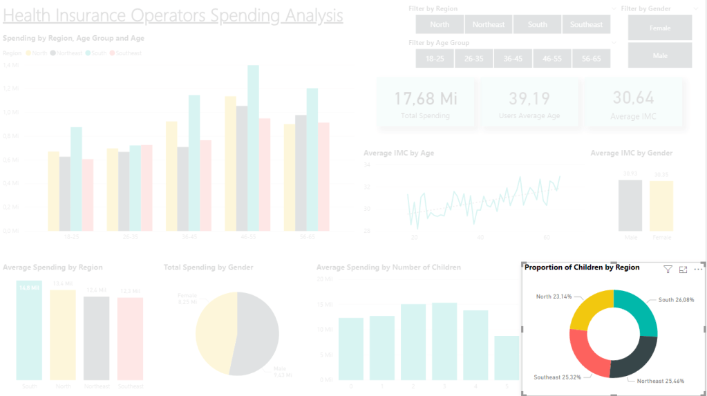
With a donut chart we can answer a proportion question, so we see the proportion of children is nearly the same for all regions, with only around 3% difference from nº1 to nº4.
Question #7: Does getting older influence on IMC values?
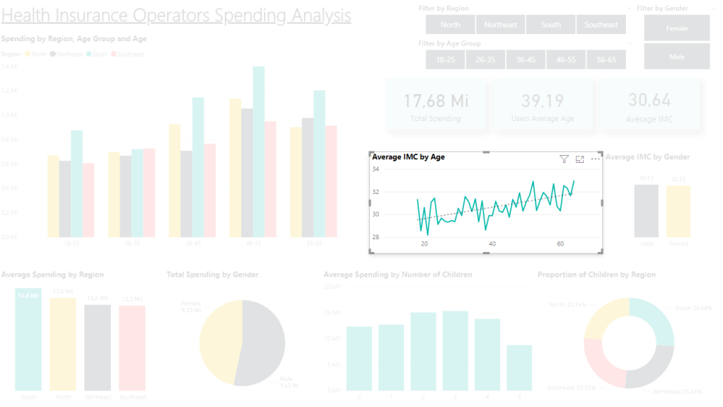
To answer this question, I considered age = time and decided to use a line chart. Looking at that visualization, we can see the tendence line pointing up, even though there are many ups and downs from age to age.
With that we can conclude that, overall, getting older has some influence over a person’s IMC getting higher, but there can be cases of people not following that tendence, hence the drops. People today have access to information and medical assistance to keep their bodies in shape, plus the influence of the ideal of perfect image portraited in media, being those some external factors that can have influence on the chart numbers and on the future. Maybe at some point we can see that tendence line stabilizing.
Question #8: Who spends the most, men or women?
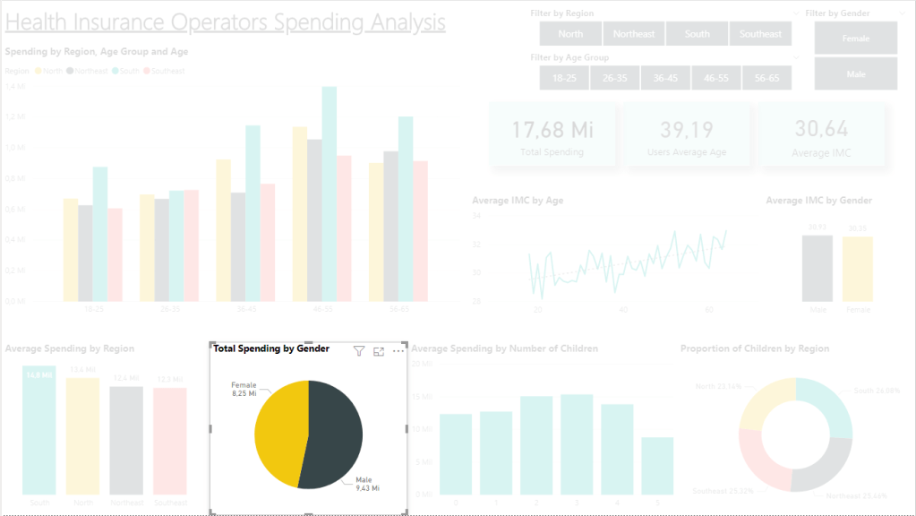
In our data, the men spent the most in total, with about 1.2 Million reais more than women. A simple pie chart took care of delivering that answer.
Question #9: If the user is a woman, is the IMC under or over the average?
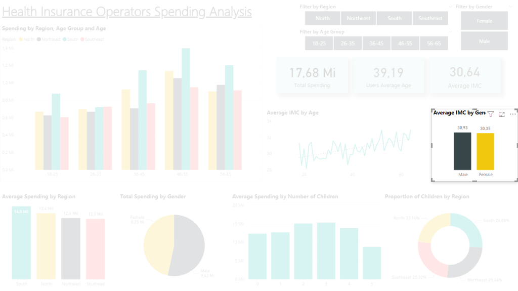
For this question we need 2 visualizations. One is the average IMC, shown by a card with the value of 30,64, the other is a bar chart showing the average by gender (pass the slide) where we see both genders are close to the average, but men are over 0,29 and women are under 0,29.
So the answer to the question is that in our data, women’s average IMC is under the general average.
Question #10: If the user is a man of 50 years from the Southeast region, does he spend more or less than the average spending of that region?
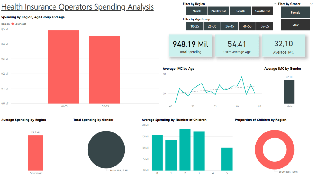
With this question, the challenger obliges us to use slicers in the visualization, so I used 3 of them: filter by region, filter by age group and filter by gender.
Clicking on the slicers according to what the question wants (Male/Southeast/46-55 and 56-65), we see the data in the picture.
The answer to the question is “the man spends more than the average spending of his region (12.3 Mil)”, but you can also observe interesting data in the other charts, such as his IMC > average for the majority of the ages between 45 and 65, peaking almost 40 IMC.
Conclusion
The challenge was a fun experience for me too see how capable I am of showing targeted information that someone asks me, since the other boards I post bring information that I choose to put there myself.
I’m happy at the result and feel like I evolved a lot from this practice. Let’s keep going!
