Hello!
In this post we are going to talk about the presence of Caffeine in certain drinks/substances we take, as well as check the daily limit and the consequences of overdoing it.
The dataset for this came from a challenge on a subreddit (r/dataisbeautiful) and it contains only 3 colums of information, being them:
- Item (drink, food, medicament, etc)
- Quantity avaliated
- Total Caffeine in the quantity
- Column added by me: Quantity of item until 400mg* of caffeine is reached
*400 mg = Maximum dose of caffeine recommended in 1 day
Tools used: MS Excel – Charts, Pivot Tables, VBA
Questions & Answers
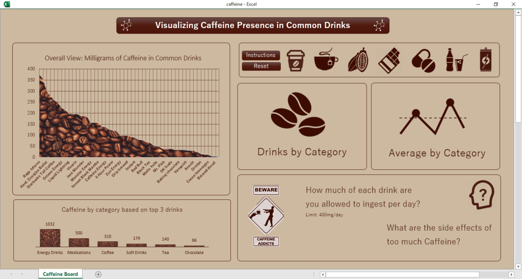
The first thing we notice in this Dashboard is that half of it seems to cointain…nothing. Well, we’ll get there!
In the left side of the board we can get to “meet” some items and categories present in our analysis, the charts can answer to some of our questions:
What is the strongest item in the list? – Rage Inferno (Energy Drink)! I mean, the name for sure helps understanding why.
Which category of item is the strongest in the list? – Energy Drinks by far! That energy boost has to come from something, right?
Now, at the right side, it looks empty because I actually used some easy VBA codes.
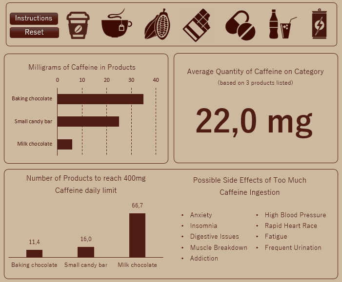
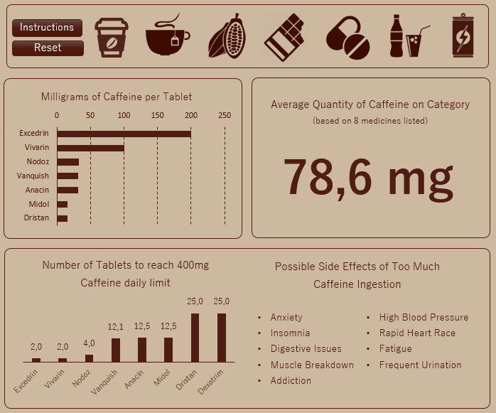
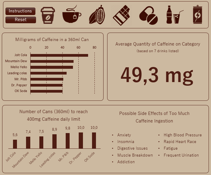
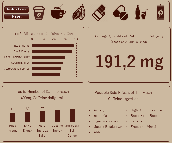
Order: Coffee – Tea – Cocoa Drinks – Chocolate Bars – Medicaments – Soft Drinks – Energy Drinks
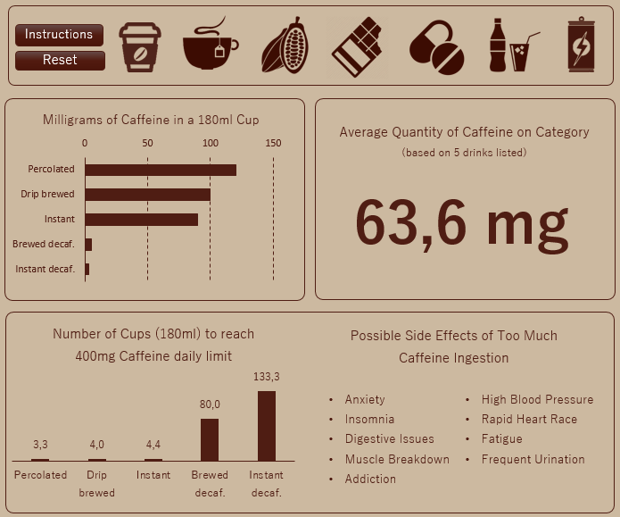
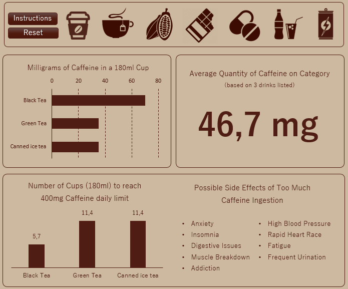
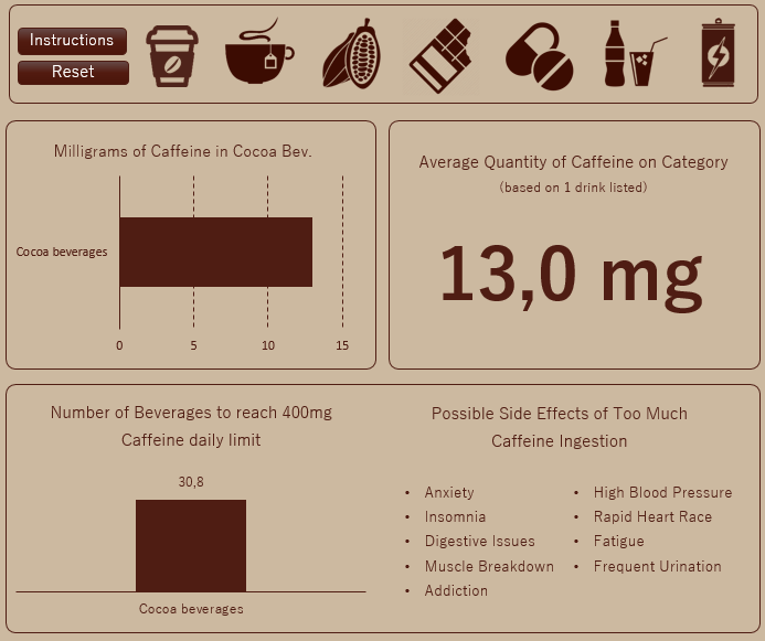
In the specific blocks we can see the differences between drinks in the same category, as well as check the average quantity based on the itens listed. In the bottom chart we see how many cups we can ingest before reaching the 400 mg maximum, for example: only 3 Percolated are enough, while we’d have to spend a long time drinking 133,3 Instant Decaffeinated in order to reach the “goal”.
The same possible side effects appear for all the categories.
Conclusion
Its possible to build a dashboard with lots of information even if you don’t have much data to work with. Just gotta use some creativity to play with the spaces and using programming to add some “magic”.
See you next time!
